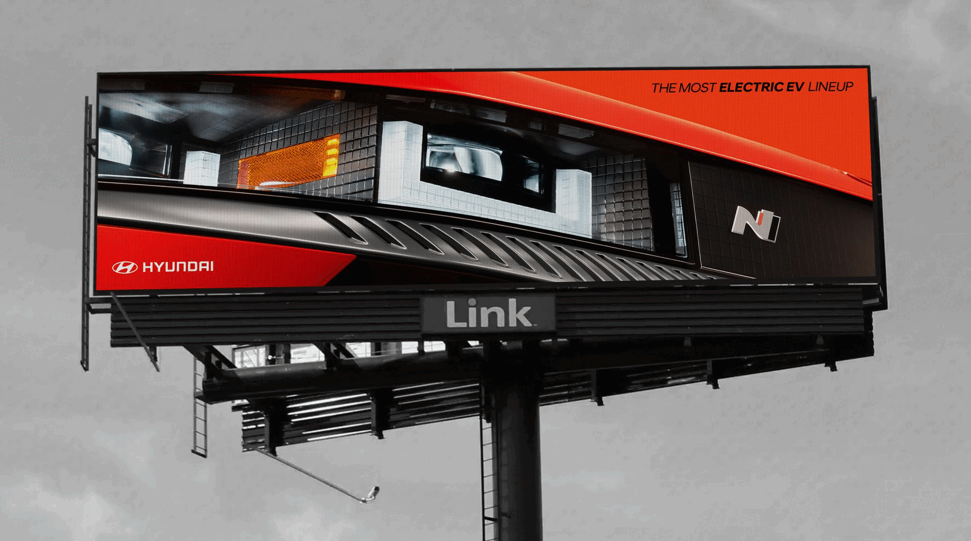
Hyundai wanted a fresh look for their all electric EV lineup so we gave them OOH that felt just as electric as the broadcast push. Bright colors and dynamic layouts were sure to stop people in their tracks. The people loved the new look and feel and while the designs were a temporary departure from rigid guides, clients jumped on it.
ECD: Gui Borchert
GCD: Tony Kalathara
CD: Jamin Duncan
AD/Designer: Kathryn Izquierdo-Gallegos
CW: Scott Shin & Hanna Koh
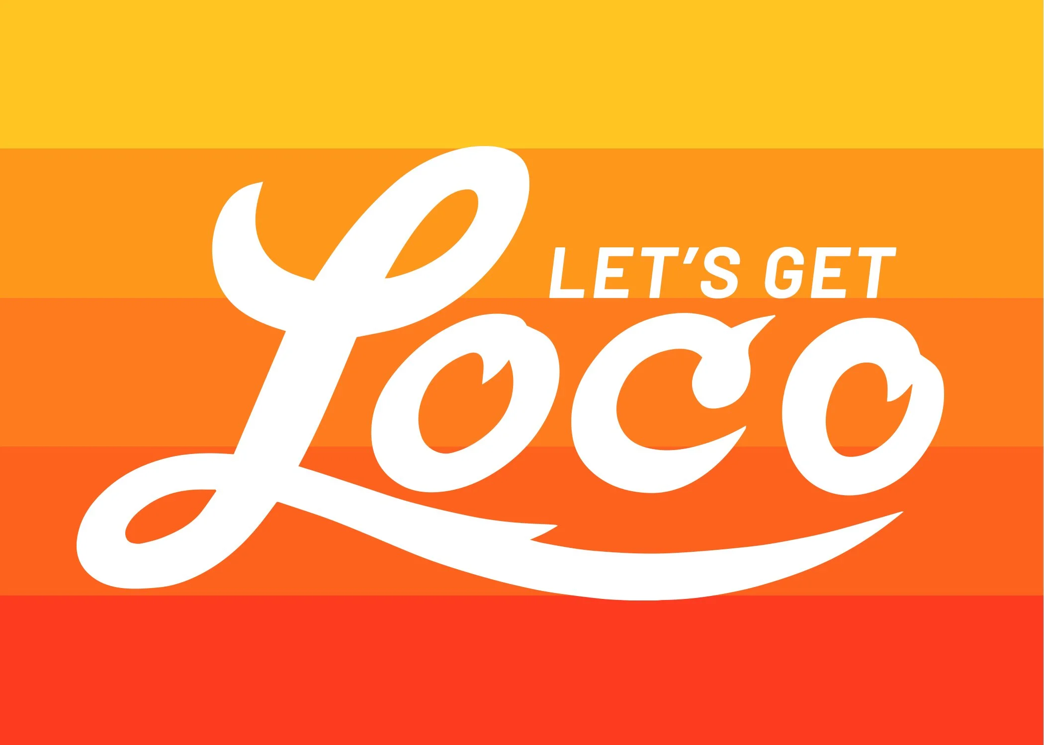
As part of our pitch to acquire El Pollo Loco, I concepted design language that helped actualize the brand platform, “Let’s Get Loco.”
Loco isn’t crazy, it’s passionate. If we were going to redefine language, why not actually create the language to go along side with it. Loco Script was the answer. A team created the script font based off The El Pollo Loco logo script. Can you believe they already didn’t have one? The script became an expressive tool to support the energy of the products and the narratives around them.
GCD: Bob Rayburn
CD: Joe Reynoso
CONCEPTUAL DIRECTION + HERO TREATMENT
Sr. AD: Kathryn Izquierdo-Gallegos
FONT CREATION + REFINEMENT
Designer: Ryan Owens
ACD Designer: Yomar Augusto
POP PHOTOGRAPHY DIRECTION
ACD: NIcole Nacey
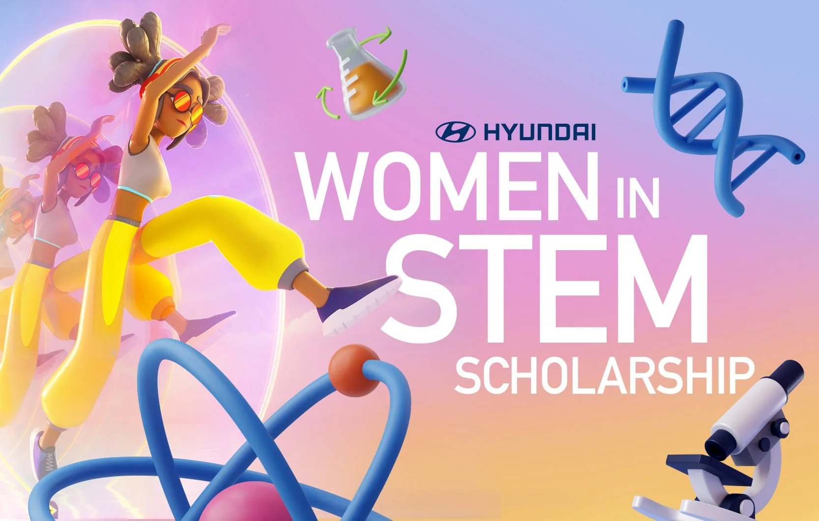
Hyundai has an annual scholarship they give out to Women in STEM. They wanted to target Gen Z so we went outside the normal rigid guidelines to create key art that would speak to the target. There were 30,000 young women that applied, which clients considered an overwhelming success.
GCD: Lori Martin
CD: Ryan Simpson
Sr. CW: Tiana Goston
Sr. AD: Kathryn Izquierdo-Gallegos
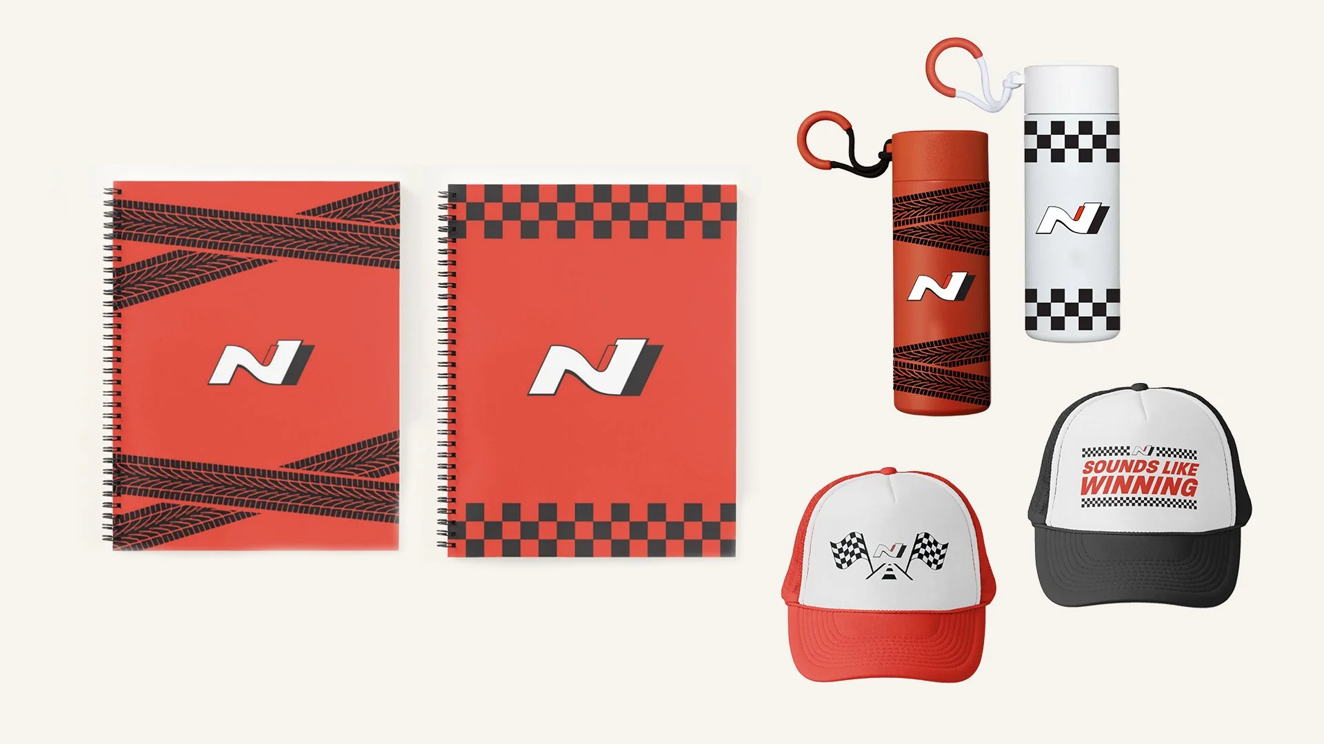
Hyundai came to us wanting merch to giveaway on social so we developed a few lines we thought people would get excited about. The Red Line (with red products) was the chosen line by clients. The items were sent as gifts to N-Line influencers. They were featured in social media content that got people commenting like crazy! Everyone wanted to find out how to get their hands on some merch.
Agency: INNOCEAN USA
GCD: Lori Martin
CD: Ryan Simpson
Sr. AD: Kathryn Izquierdo-Gallegos
Client: the heart series
Art Direction / Design: Kathryn Izquierdo-Gallegos
Graphic Designer: Kathryn Izquierdo-Gallegos
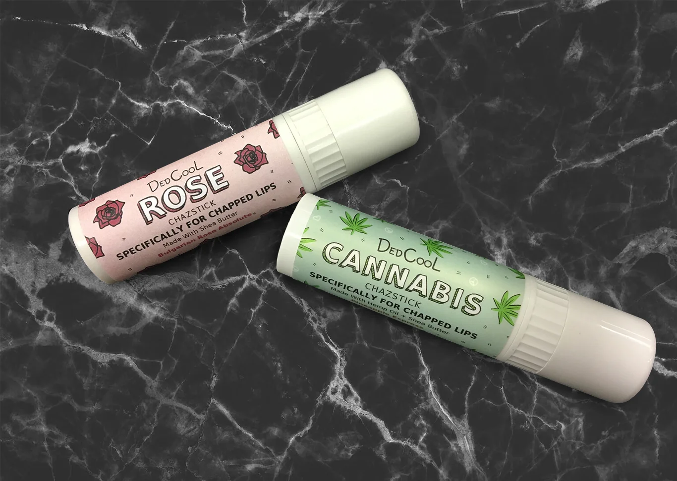
Client: DedCool
Print: Product Sample Pack card and lip balm package designs.
Digital: Email blasts
The client desired an Oscar-esque look for their social media graphics. They specifically desired shiny letters and a formal look.
Client: Hispanic Heritage Foundation
Firm: verynice
Art Director: Alisa Olinova
APPLICATIONS
Digital:
2 Facebook covers and 3 countdown graphics
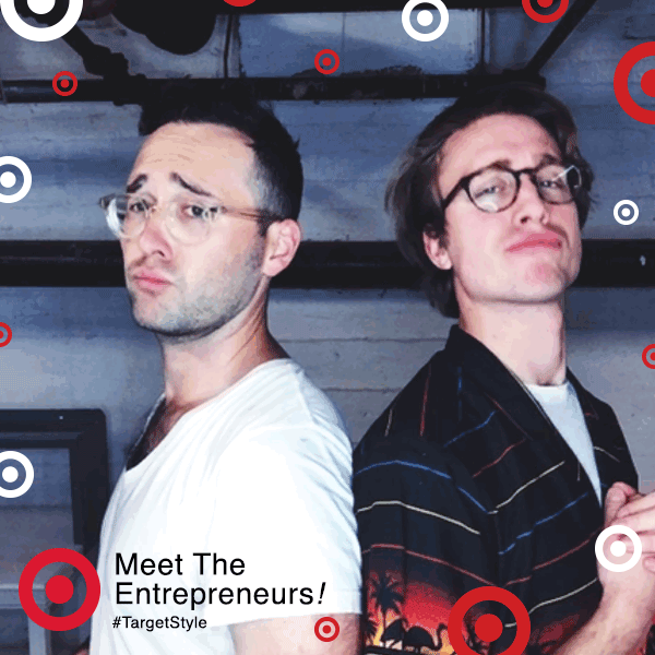
Various print and digital photo booth designs were created for different clients for the BOSCO. Clientele included brands like Target, New York Times, TED, Usher, American Express, Toyota, etc.
Art Director: Alisa Olinova
Firm: verynice
Client: the Bosco
Branded collateral for an exhibit featuring artist, Fred Rose. The exhibit featured wood sculpture repurposed by the artist. Over 400 guests attended the event throughout its duration.
Art Director: Michele Cairella Fillmore
Client: The Huntley Art Gallery
Photo Credit: Bill Gunn
CAMPAIGN APPLICATIONS
Digital: Electronic billboard, Facebook cover, Instagram square and e-blast
Print: Tabloid poster (folded mailer), outdoor signage (18x24”), staff/artist name tags (3x4”), 2 curatorial exhibit panels (16x30” & 33x40”), title wall (8x4’) and 1 artist panel (16x20”)
Branded an exhibit featuring 4 artists. The exhibit showcased artists that incorporated organic themes into their work. The show attracted over 3,500 visitors on and off campus. This was the first exhibit where all promotional materials were design by a student designer. Initiated effort to apply acquired skills in a real world setting.
Art Director: Michele Cairella Fillmore
Client: W. Keith & Janet Kellogg Gallery
CAMPAIGN APPLICATIONS
Print: Tabloid poster mailer, outdoor signage (18x24”), staff/artist name tags (3x4”), 2 curatorial exhibit panels (16x30” & 33x40”), 1 artist panel (16x20”) and title wall (18x5’)
Digital: Electronic billboard, Facebook cover, Instagram square, e-blast
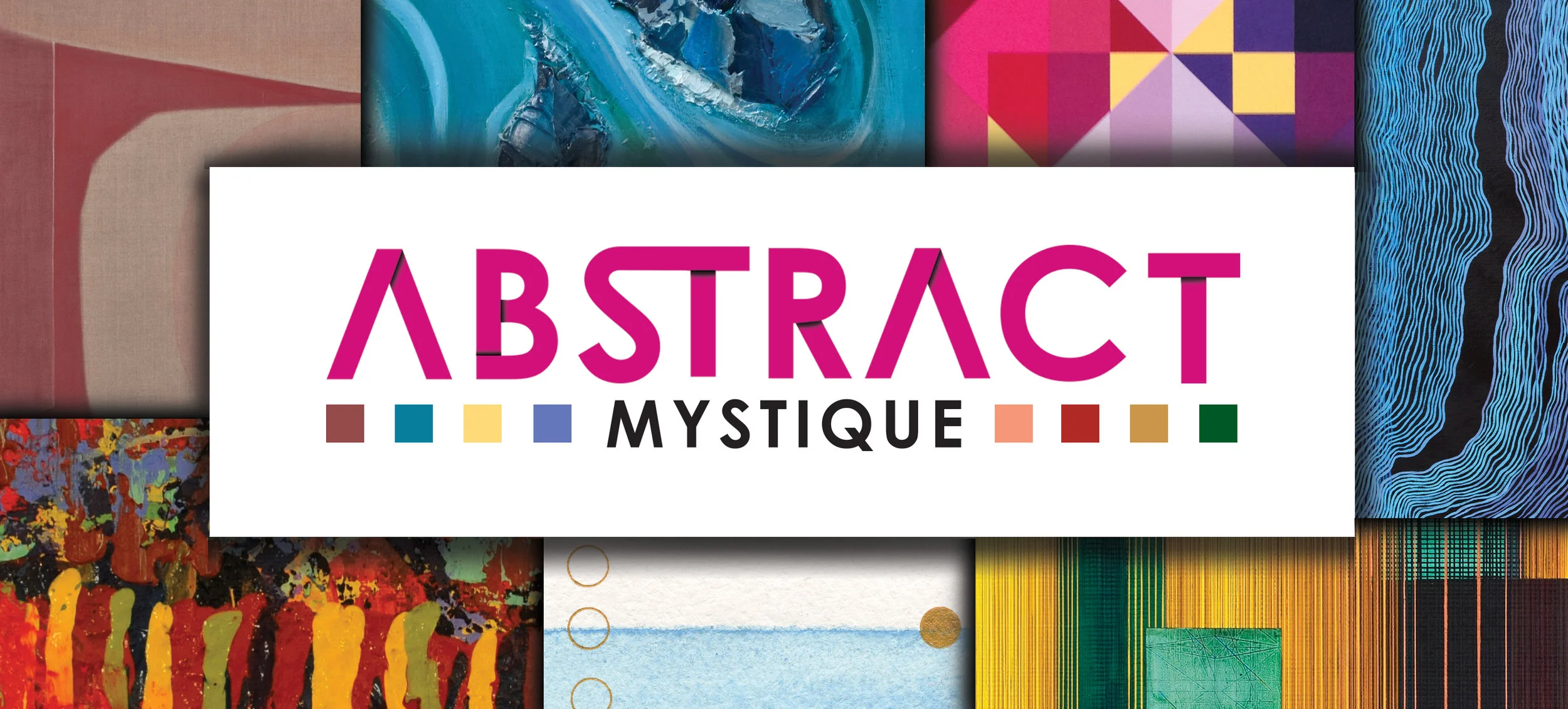
Branded an exhibit featuring 8 female abstract artists. Two thousand mailers were produced for promotion. Over 1,200 (60%) guests attended the exhibition throughout its duration.
Art Director: Michele Cairella Fillmore
Client: W. Keith & Janet Kellogg Art Gallery
CAMPAIGN APPLICATIONS
Digital: Electronic billboard, Facebook cover, Instagram square and e-blast
Print: Tabloid poster (folded mailer), outdoor signage (24x18”), staff/artist name tags (3x4”), title wall (18x5’), 2 curatorial exhibit panels (18x24”) and 8 artist panels (18x20”)
As part of an effort to expand workshop materials for verynice, I created a series of animated GIFs and 1 pagers. These materials were used for in person workshops and were an expansion on an existing design system.
Art Director: Alisa Olinova
Studio: verynice.
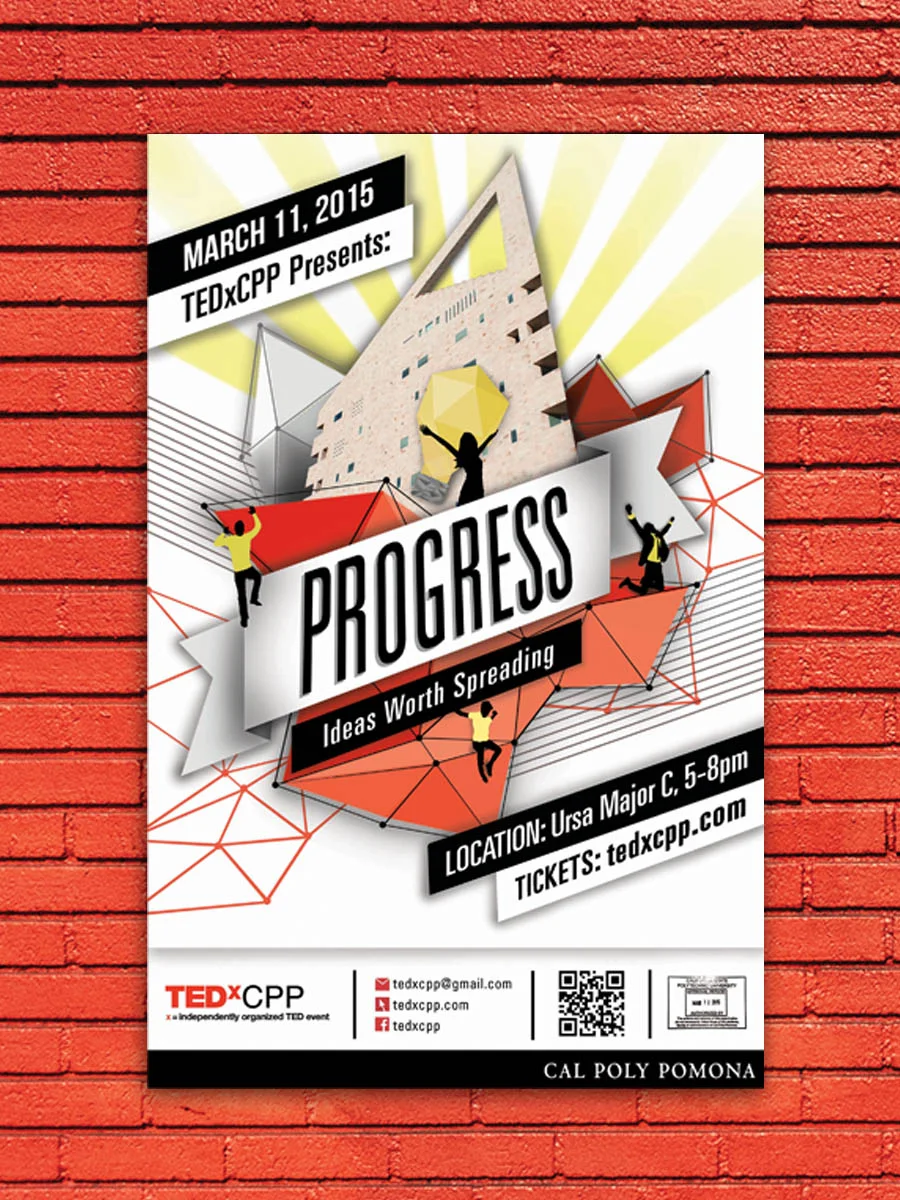
Aided with branding and execution of Cal Poly Pomona’s inaugural TEDx conference, Progress. Branding communicated campus tie and aligned with the theme. Over 700 people registered for the event. The president of the university along with other university VIPs and students attended the event.
Graphic Designer: Kathryn Izquierdo-Gallegos
Client: TEDxCPP
CAMPAIGN APPLICATIONS
Digital: Electronic billboard, Facebook cover, Instagram square, e-invite and website banner
Print: Tabloid poster, ¼ letter handbills, guest name tags (3x4”), lanyards, event table toppers (5x10x5”), pens, tote, letter-sized VIP & general event programs and podium seal (15x15”)
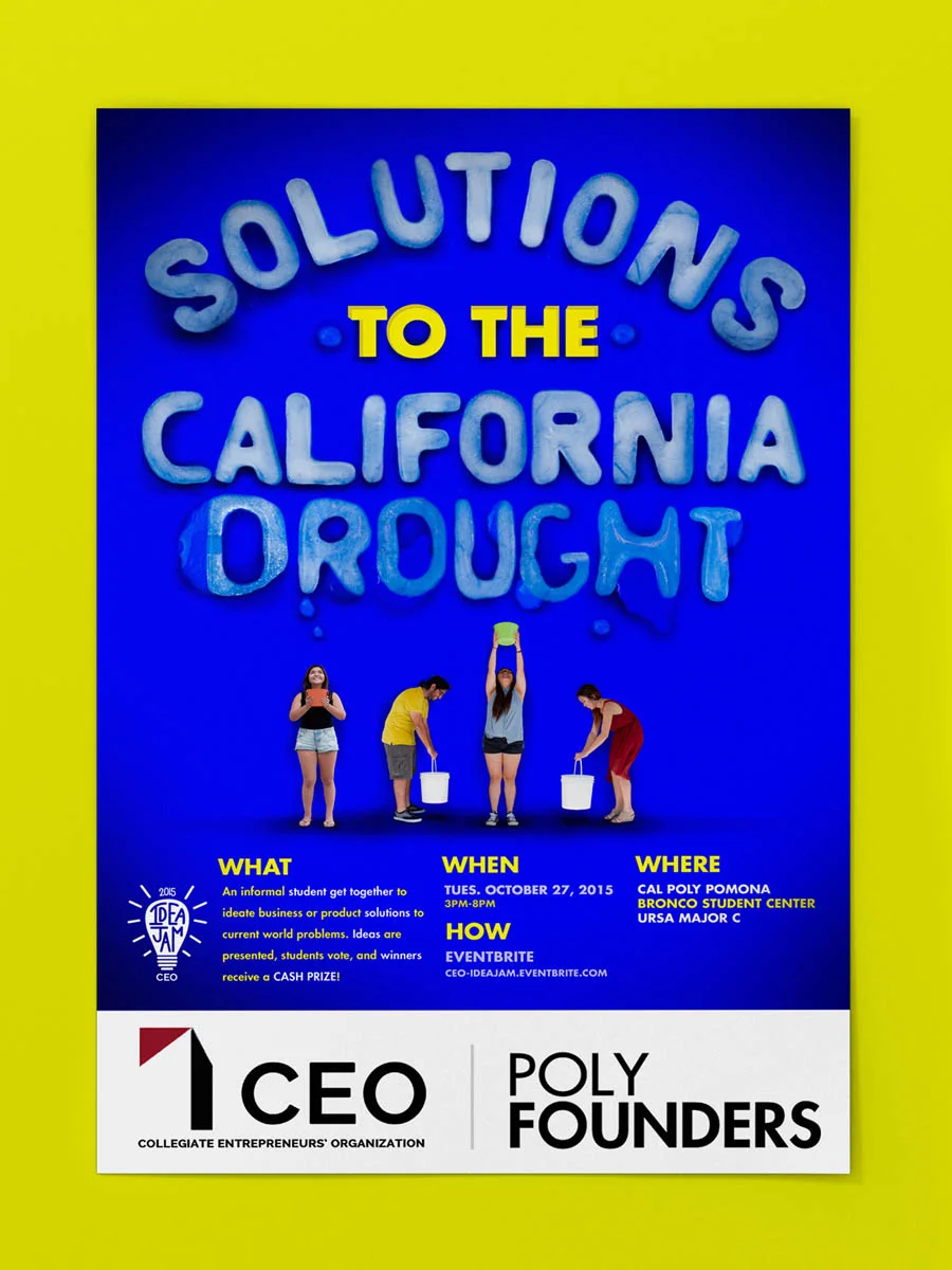
Branded CEO’s annual Idea Jam for the theme, Solutions to the California Drought. Idea Jam is recognized at Cal Poly Pomona as a business concept competition for students, which is geared to solve social and environmental problems. Over 100 students participated in the event ideating products and services to address the drought.
Client: CEO-Collegiate Entrepreneurs’ Organization
CAMPAIGN APPLICATIONS
Digital: Website banner, Facebook cover, Instagram square and e-blast
Print: Tabloid posters, ¼ letter handbills, letter-sized first place certificate and letter pamphlets
Branded and designed a line of packaging to be sold at Circus World, a circus museum. Carnie Folk products were designed to reference the history of circuses and play off guest associations of the circus experience. The Carnie Folk product line targets families and appeals heavily to children.
Packaging Sizes: Peanuts (4x10.25x3.25”), Animal Cookies (5x9.5x5”), Strawberry Lemon (4 x12”), Bag (13x13x5”) and Carnie Carriage (6.5x6x3.5”)
Art Director: Babette Mayor
Client: Circus World, Concept piece
Ink & Clay Title Wall
Designed extruding type for a national exhibit, Ink & Clay 40. Although no clay was used, the extruding type was used to convey the 3D nature of ceramics.
Art Director: Michele Cairella Fillmore
Client: Kellogg University Art Gallery
Construction: Jason Reed and Kat
Materials: Insulation foam, hot wire cutter, glue, vinyl fabric, industrial velcro, sponge and paint
Charette Installation
Created an installation using experimental type for a department wide juried exhibition themed, "change." Two days were allowed for concept and execution.
Materials: 2" ribbon, foam wall and pins
Awards: "Best of Charette" among other recipients
Poly-Kroma Installation
Managed a group of 5 people to create an entrance installation for poly-kroma an art department senior show. Created the "m" in the word "poly-kroma."
Materials: wood, stain, nails, nail gun, zip ties and wheat grass
Purchased By: Michael Woo, Dean of Environmental College
Up To KNOW GOOD Installation
ubmitted an ink installation to Ink & Clay 40, a national juried exhibition. Aided with concept development and designed type treatment. Aided with sourcing materials and installation.
Awards: Ink & Clay 40 Juror's Award
Materials: painter's tape, projector, Exacto knife, printmaker's ink and water
Team: Socrates Medina, Architect & Tyler Stewart, Designer